Regression models: Curve-linear relationships
Introduction
This lesson contains extensions of the linear regression models where we model curve-linear relationships. In the last lesson we focused on straight lines, here we will see that we can bend the line in our model.
A common scenario for the curve in sport science
We routinely calculate lactate thresholds in our lab. The physiological background is that lactate accumulates as a consequence of change in balance between aerobic and anaerobic metabolisom during exercise. A lactate threshold test measures lactate concentrations during incremental intensity to determine the relationship between exercise intensity and lactate concentration.
The cyclingStudy data set contains data from such tests. We first need to do some data wrangling. We first will focus on one participant.
library(readxl); library(tidyverse)

 read_excel("./data/cyclingStudy.xlsx", na = "NA") %>%
        filter(timepoint == "pre", subject == "7") %>%
   select(subject, lac.125:lac.375) %>%
   pivot_longer(names_to = "intensity",
                values_to = "lactate",
                cols = lac.125:lac.375) %>%
   print()
Using the above code you can see that participant 7 has measured lactate from 125 W to 300 W. To remove the lac. part from the intensity we can use the gsub() function. Let’s also filter away the NAs.
 read_excel("./data/cyclingStudy.xlsx", na = "NA") %>%
        filter(timepoint == "pre", subject == "7") %>%
   select(subject, lac.125:lac.375) %>%
   pivot_longer(names_to = "intensity",
                values_to = "lactate",
                cols = lac.125:lac.375) %>%
   mutate(intensity = gsub("lac.", "", intensity),
          intensity = as.numeric(intensity)) %>%
   filter(!is.na(lactate)) %>%
   print()
The code below makes abasic plot of the relationship.
 read_excel("./data/cyclingStudy.xlsx", na = "NA") %>%
        filter(timepoint == "pre", subject == "7") %>%
   select(subject, lac.125:lac.375) %>%
   pivot_longer(names_to = "intensity",
                values_to = "lactate",
                cols = lac.125:lac.375) %>%
   mutate(intensity = gsub("lac.", "", intensity),
          intensity = as.numeric(intensity)) %>%
   filter(!is.na(lactate)) %>%
   ggplot(aes(intensity, lactate)) +
  geom_point(shape = 21, size = 2, fill = "lightblue") +
  theme_minimal()
From the plot we can clearly see that the relationship is curve-linear, meaning that a straight line will have problems explaining the data. We can add a straight line to the plot to prove this. To add lines we will use the ggplot function and geom_smooth(method = "lm", se = FALSE). method = "lm" specify that we are interested in an ordinary linear model, se = FALSE says that we do not want any confidence bounds around the straight line.
 read_excel("./data/cyclingStudy.xlsx", na = "NA") %>%
        filter(timepoint == "pre", subject == "7") %>%
   select(subject, lac.125:lac.375) %>%
   pivot_longer(names_to = "intensity",
                values_to = "lactate",
                cols = lac.125:lac.375) %>%
   mutate(intensity = gsub("lac.", "", intensity),
          intensity = as.numeric(intensity)) %>%
   filter(!is.na(lactate)) %>%
   ggplot(aes(intensity, lactate)) +
  geom_point(shape = 21, size = 2, fill = "lightblue") +
  # Add a straight line
  geom_smooth(method = "lm", se = FALSE) +

  theme_minimal()
By running the code, you can clearly see that the straight line under estimates the first and last data point and over estimates the other points.
To folllow through, we can fit a regression model that describes the straight line.
# Save the data in an object
dat <- read_excel("./data/cyclingStudy.xlsx", na = "NA") %>%
        filter(timepoint == "pre", subject == "7") %>%
   select(subject, lac.125:lac.375) %>%
   pivot_longer(names_to = "intensity",
                values_to = "lactate",
                cols = lac.125:lac.375) %>%
   mutate(intensity = gsub("lac.", "", intensity),
          intensity = as.numeric(intensity)) %>%
   filter(!is.na(lactate))

# Fit a simple model

m <- lm(lactate ~ intensity, data = dat)

# Look at the results

summary(m)

# Make a residual plot

dat$resid <- resid(m)
dat$fitted <- fitted(m)

dat %>%
  ggplot(aes(fitted, resid)) + geom_point() + theme_minimal()
Think about the residual plot, it confirms what we already suspected, right?
To make a better fit to the data we need to make use of polynomials!
Curve-linear regression models
We can first see if a curve linear model does a better job by plotting it. We can extend geom_smooth to also incorporate polynomials using the formula argument.
 read_excel("./data/cyclingStudy.xlsx", na = "NA") %>%
        filter(timepoint == "pre", subject == "7") %>%
   select(subject, lac.125:lac.375) %>%
   pivot_longer(names_to = "intensity",
                values_to = "lactate",
                cols = lac.125:lac.375) %>%
   mutate(intensity = gsub("lac.", "", intensity),
          intensity = as.numeric(intensity)) %>%
   filter(!is.na(lactate)) %>%
   ggplot(aes(intensity, lactate)) +
  geom_point(shape = 21, size = 2, fill = "lightblue") +
  # Add curved line
  geom_smooth(method = "lm", se = FALSE, formula = y ~ poly(x, 2)) +

  theme_minimal()
The addition of formula = y ~ poly(x, 2) fits a second degree polynomial model to the data. This is equivalent to
\[y_i=\beta_0+\beta_1x_i+\beta_2x^2_i\] where \(i\) indicates each observation, \(\beta\) are coefficients, \(x_i\) and \(x_i^2\) are the predictors (intensity) where a second predictor is added as a squared term (\(x_i^2\)).
It turns out that a third degree polynomial function generally fits the lactate-intensity relationship better(Heuberger et al. 2018).
\[y_i=\beta_0+\beta_1x_i+\beta_2x^2_i+\beta_2x^3_i\] Both above polynomial functions are special cases of multiple regression. With the special part being that the predictors (\(x\), \(x^2\) and \(x^3\)) are correlated. R avoids problems with correlations between predictors in polynomial regression by converting them to orthogonal using the poly function.
Moving back to our example data we can use the poly function to add an extra term, to make the underlying regression model a third degree model.
 read_excel("./data/cyclingStudy.xlsx", na = "NA") %>%
        filter(timepoint == "pre", subject == "7") %>%
   select(subject, lac.125:lac.375) %>%
   pivot_longer(names_to = "intensity",
                values_to = "lactate",
                cols = lac.125:lac.375) %>%
   mutate(intensity = gsub("lac.", "", intensity),
          intensity = as.numeric(intensity)) %>%
   filter(!is.na(lactate)) %>%
   ggplot(aes(intensity, lactate)) +
  geom_point(shape = 21, size = 2, fill = "lightblue") +
  # Add curved line
  geom_smooth(method = "lm", se = FALSE, formula = y ~ poly(x, 3)) +

  theme_minimal()
We could also compare the different models to check which one makes the better fit. First we use the straight line and then add the polynomial terms. We mentioned \(R^2\) earlier, this is a meassure of how much of the variation in the data that can be explained by the model. Let’s compare \(R^2\) between models.
# A model with a straight line
m <- lm(lactate ~ intensity, data = dat)

# A model with 2nd degree polynomial
m2 <- lm(lactate ~ poly(intensity,2), data = dat)

# A model with 3rd degree polynomial
m3 <- lm(lactate ~ poly(intensity,3), data = dat)


library(knitr)

data.frame(model = c("Straight line",
                     "Second degree polynomial",
                     "Third degree polynomial"),
           R.squared = c(round(summary(m)$r.squared, 3),
                         round(summary(m2)$r.squared, 3),
                         round(summary(m3)$r.squared, 3)))  %>%
kable(caption = c("Model", "R-squared"))| model | R.squared |
|---|---|
| Straight line | 0.634 |
| Second degree polynomial | 0.950 |
| Third degree polynomial | 0.998 |
We can see that the the third degree model almost perfectly predicts the data! (See page 465 in (Navarro 2020) for a explenation about \(R^2\)). This is good for our purposes!
The aim of this analysis is to predict the exercise intensity at which we reach a specific lactate value. The 4 mmol threshold has a long history and is still very much in use in exercise science.
Using the predict function we can take our model and insert new values for intensity to predict the lactate value. The code below makes use of the m3 model and the predict function. predict lets you insert your own x value, in our case an intensity value and you will get a predicted y value in return (in our case lactate).
predict(m3, newdata = data.frame(intensity = 281.3))## 1
## 3.992802This is a slow process where you eventually find a value that predicts 4 mmol. I was not able to find a function to directly predict x from y values, so we need to make some programming:
A first step is to create a lot of intensity data to predict over.
new_data <- data.frame(intensity = seq(from = 125, to = 300, by = 0.01))We then use the predict function together with our model (m3) to predict lactate values
preds <- predict(m3, newdata = new_data)To find what value of intensity best correspond to a lactate value of 4 we need to device a function where we locate the predicted value closest to 4. I name the function “closest.” It returns the index of the value closest to four.
closest <- function(xv, sv) {
                  which(abs(xv-sv) == min(abs(xv-sv)))}
We finnaly combine the closest function and the new_data data frame created above to predict new values. The code below returns the row corresponding to the intensity value closest to where lactate is 4 mmol.
intensity_at_4mmol <- new_data[closest(preds, 4), ]We can finnaly use our predicted value in the plot:
 read_excel("./data/cyclingStudy.xlsx", na = "NA") %>%
        filter(timepoint == "pre", subject == "7") %>%
   select(subject, lac.125:lac.375) %>%
   pivot_longer(names_to = "intensity",
                values_to = "lactate",
                cols = lac.125:lac.375) %>%
   mutate(intensity = gsub("lac.", "", intensity),
          intensity = as.numeric(intensity)) %>%
   filter(!is.na(lactate)) %>%
   ggplot(aes(intensity, lactate)) +
  geom_point(shape = 21, size = 2, fill = "lightblue") +
  # Add curved line
  geom_smooth(method = "lm", se = FALSE, formula = y ~ poly(x, 3)) +

  # Add a predicted point
  geom_point(data = data.frame(lactate = 4, intensity = intensity_at_4mmol),
             shape = 21,
             fill = "red",
             size = 4) +

  theme_minimal()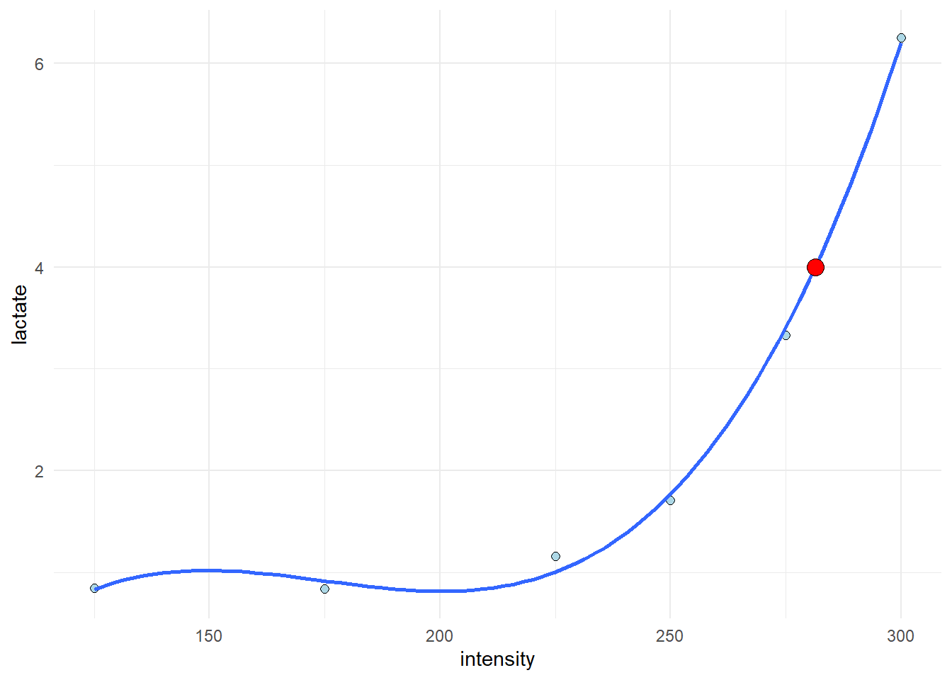
Summary
The regression model is very flexible, we can model different curve linear relationships and this is useful when analyzing for example lactate data. The code used above exemplifies a single case but can be extended to many cases by fitting multiple models, one for each participant and time-point in a e.g. a pre- post-trainin study.