Create R-examples
Introduction
Examples in R are extremely helpful as you often do stuff that has been done before. Examples tend do give more meaning when you are using data sets that are known. In R examples, commonly used data sets are built-in in different R packages. The mtcars data set is an example of a data set used to show basic data wrangling.
The aim of this group exercise is to write R examples using a data set that we know of. I also encurage you to write in your preffered language (Norsk!).
Exercises
The exercises are designed with an known outcome, what you want to achieve, from a given starting point. They represent common scenarios in data wrangling and plotting of data. All exercises uses the data set provided bu Haun et al. 2019. Write the example with a introduction of what you want to achieve with a list detailing what you will do. Write code chunks that does the operation (with short comments). If you only want to show code in your example without having R evaluate it put eval = FALSE in the code chunk label {r, eval = FALSE}. There might be suggestions in other exercises than the one written specifically for your group to help you to solve the exercise. If you finish early, try another groups exercise.
Group 1
Plotting in ggplot2 often requires data to be in a long format. You are expected to write an example where changes in CSA are differentiated between fast and slow fiber types. The final figure should look something like this:
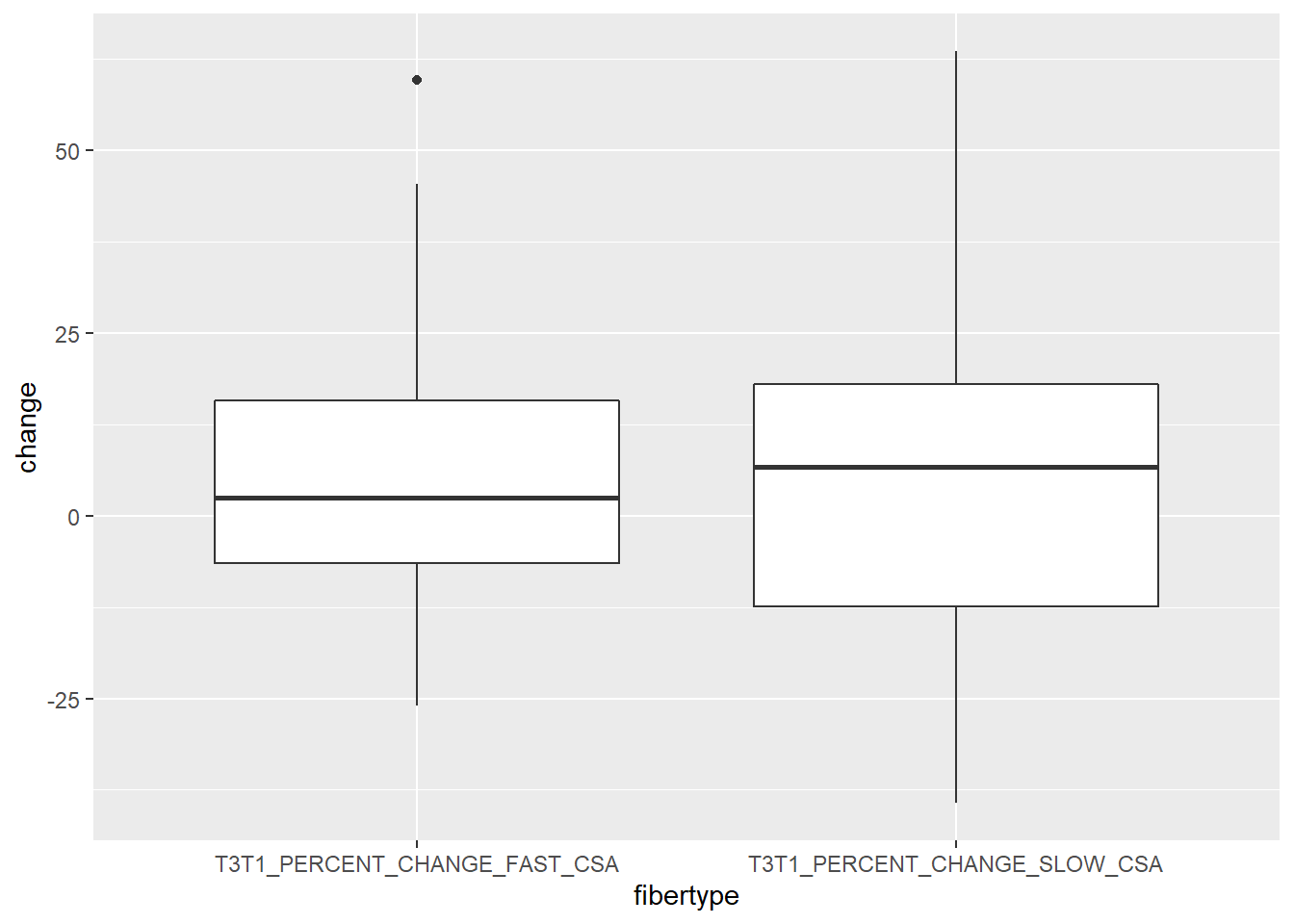
The problem is that the data set looks like this when we select the variables SUB_ID, T3T1_PERCENT_CHANGE_FAST_CSA and T3T1_PERCENT_CHANGE_SLOW_CSA:
## # A tibble: 30 x 3
##    SUB_ID T3T1_PERCENT_CHANGE_FAST_CSA T3T1_PERCENT_CHANGE_SLOW_CSA
##    <chr>                         <dbl>                        <dbl>
##  1 MRV001                        14.7                        -12.3
##  2 MRV002                        16.2                         10.0
##  3 MRV003                        39.8                         14.8
##  4 MRV004                        -2.55                        12.0
##  5 MRV005                        59.7                         63.6
##  6 MRV006                        -6.87                       -18.2
##  7 MRV007                         7.7                        -12.5
##  8 MRV009                        25.7                          3.1
##  9 MRV010                        -0.63                        -3.38
## 10 MRV011                        45.4                         26.6
## # ... with 20 more rows
And before plotting, we would like it to look like this:
## # A tibble: 60 x 3
##    SUB_ID fibertype                    change
##    <chr>  <chr>                         <dbl>
##  1 MRV001 T3T1_PERCENT_CHANGE_FAST_CSA  14.7
##  2 MRV001 T3T1_PERCENT_CHANGE_SLOW_CSA -12.3
##  3 MRV002 T3T1_PERCENT_CHANGE_FAST_CSA  16.2
##  4 MRV002 T3T1_PERCENT_CHANGE_SLOW_CSA  10.0
##  5 MRV003 T3T1_PERCENT_CHANGE_FAST_CSA  39.8
##  6 MRV003 T3T1_PERCENT_CHANGE_SLOW_CSA  14.8
##  7 MRV004 T3T1_PERCENT_CHANGE_FAST_CSA  -2.55
##  8 MRV004 T3T1_PERCENT_CHANGE_SLOW_CSA  12.0
##  9 MRV005 T3T1_PERCENT_CHANGE_FAST_CSA  59.7
## 10 MRV005 T3T1_PERCENT_CHANGE_SLOW_CSA  63.6
## # ... with 50 more rows
A suggestion is to look into the help pages describing pivot_longer and pivot_wider and describe their use.
To get started, here is example code for downloading and selecting the variables:
library(tidyverse)

hypertrophy <- read_csv("https://ndownloader.figstatic.com/files/14702420")


hypertrophy %>%
  select(SUB_ID, T3T1_PERCENT_CHANGE_FAST_CSA, T3T1_PERCENT_CHANGE_SLOW_CSA) %>%
  print()
Use geom_boxplot() in ggplot2 to create the graph. You are free to nmake the plot nicer, consider the following:
- Change the labels and levels of the factor
fibertype - Change axis labels
- Add colors to the boxes
Group 2
Before plotting data it is common to do some kine of summary of the data. In ggplot2, some “geoms” does this for you but not all. In this example you are expected to describe how to summarize data and use point estimates with some measure of variation in the graph. The final figure should look something like this:
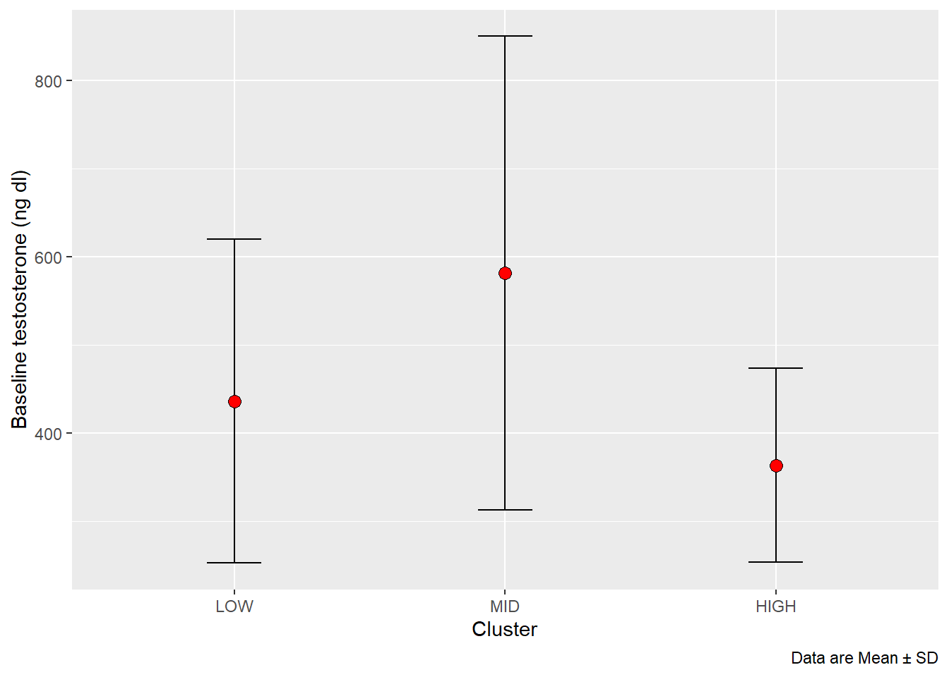
This is a case of group_by and summarise.
Things to consider:
- The axis labels of the plot
- The addition of the “MID” cluster (try
mutate(CLUSTER = if_else(is.na(CLUSTER), "MID", CLUSTER))) - Change the levels of the CLUSTER factor
- The caption (to get the ± sign, write use
\u00B1in thelabsfunction in ggplot)
Group 3 and 4
To plot variables over time we need to create a long data set. We are here interested in plotting lean body mass over time, the data are now stored in the variables DXA_LBM_1, DXA_LBM_2 and DXA_LBM_3, where 1, 2 and 3 are time-points in the study. We also would like to separate the plotting per group, including a “MID” group. The resulting plot should look something like this.
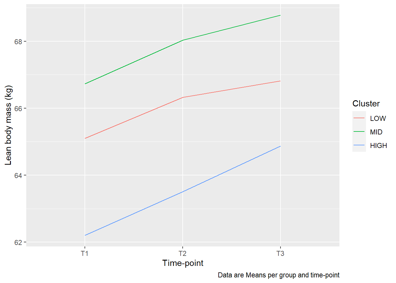
Things to consider:
- Changing the axis labels and color labels (look up
labsin ggplot2 documentation) - Check out
?pivot_longer, - Change the labels or re-write the whole time variable to get the right labelling
- This is a case of
group_byandsummarise, make sure to use a group and time variable for grouping - What summary function should you use?
- In
aes(), grouping needs to be set to cluster (group = CLUSTER) to make lines between data points. - Add a figure caption.