Go to basic R
Go to importing data
Go to summarising data
Exercise 1. Using the cycling study data set, plot the \(\dot VO_{2max}\) as a function of time (timepoint of x-axis and VO2.max on the y-axis). Plot box-plots per group.
Solution Ex. 1
# load packages
library(tidyverse)
library(readxl)

cyclingStudy <- read_excel("./data/cyclingStudy.xlsx", na = "NA") # remember to use the na argument

cyclingStudy %>%
        select(subject, group, timepoint, VO2.max) %>%
        ggplot(aes(timepoint, VO2.max, color = group)) + geom_boxplot()
Exercise 2. Using the cycling study data set, plot the \(\dot VO_{2max}\) per kg body weight weight.T1as a function of time (timepoint of x-axis and VO2.max on the y-axis). Plot box-plots per group. Control the order of the timepoint factor so that “pre” is first followed by “meso1”, “meso2” and “meso3”.
Solution Ex. 2
# load packages
library(tidyverse)
library(readxl)

cyclingStudy <- read_excel("./data/cyclingStudy.xlsx", na = "NA") # remember to use the na argument

cyclingStudy %>%
        select(subject, group, timepoint, VO2.max, weight.T1) %>%
        mutate(vo2max.kg = VO2.max / weight.T1,
               timepoint = factor(timepoint, levels = c("pre", "meso1", "meso2", "meso3"))) %>%

        ggplot(aes(timepoint, VO2.max, color = group)) + geom_boxplot()
Exercise 3. Using the cycling study data set, plot the \(\dot VO_{2max}\) per kg body weight weight.T1as a function of time (timepoint of x-axis and VO2.max on the y-axis). Instead of box plots, set color per group but show each data point with points and connected line. The lines should connect per subject, you need to control group = in aes. Control the order of the timepoint factor so that “pre” is first followed by “meso1”, “meso2” and “meso3”.
Solution Ex. 3
# load packages
library(tidyverse)
library(readxl)

cyclingStudy <- read_excel("./data/cyclingStudy.xlsx", na = "NA") # remember to use the na argument

cyclingStudy %>%
        select(subject, group, timepoint, VO2.max, weight.T1) %>%
        mutate(vo2max.kg = VO2.max / weight.T1,
               timepoint = factor(timepoint, levels = c("pre", "meso1", "meso2", "meso3"))) %>%
        ggplot(aes(timepoint, VO2.max, color = group, group = subject)) + geom_point() + geom_line()
Exercise 4. Do your best to replicate the figure below.
Things to google:
- “remove legend from ggplot”
- “Adding plus minus sign to ggplot title”
- “Change shape of geom_point ggplot2”
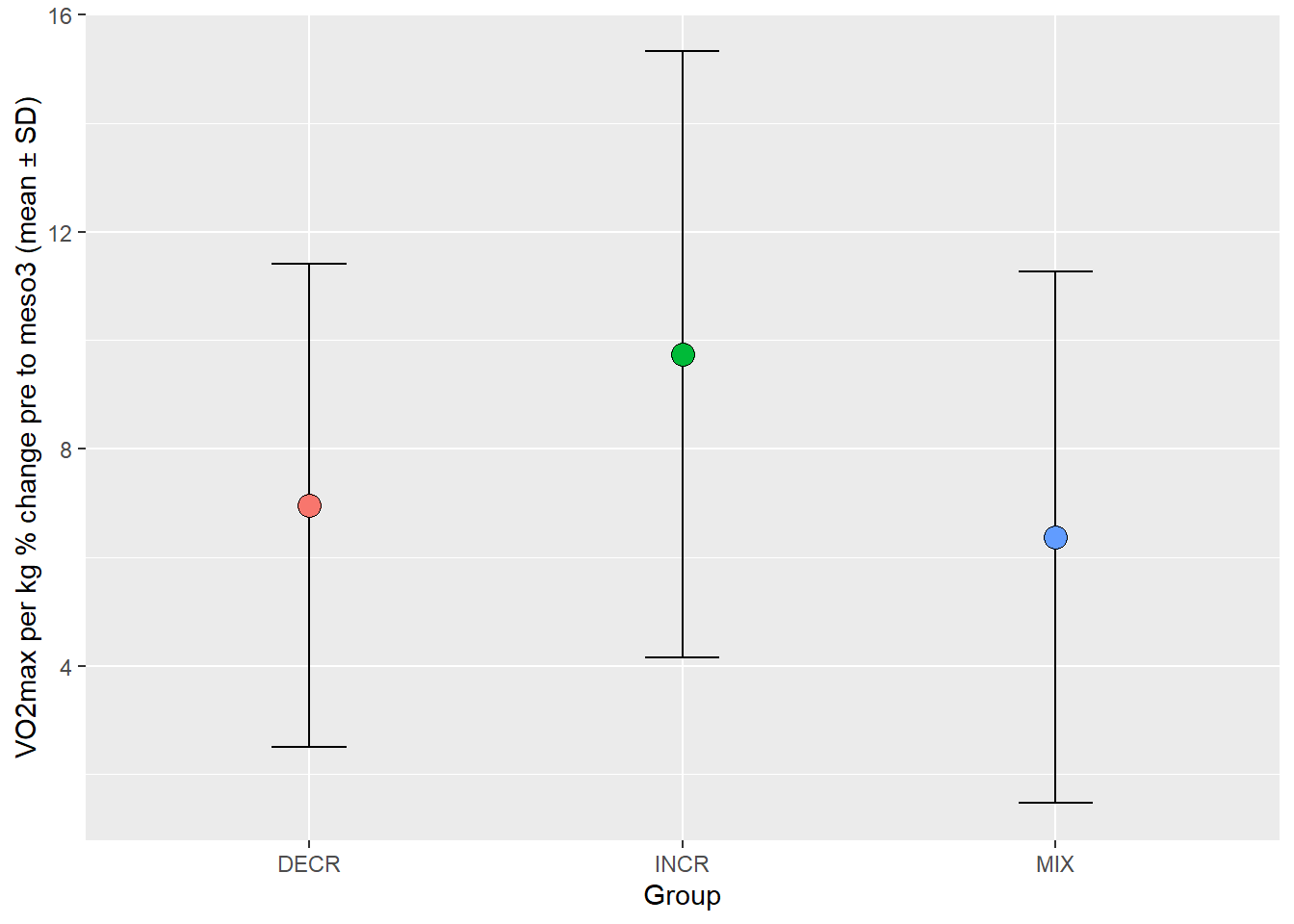
Solution Ex. 4
# load packages
# load packages
library(tidyverse)
library(readxl)

cyclingStudy <- read_excel("./data/cyclingStudy.xlsx", na = "NA") # remember to use the na argument

cyclingStudy %>%
        # Calculate relative vo2max
        mutate(vo2max.kg = VO2.max / weight.T1) %>%
        # Select variables
        select(subject, group, timepoint, vo2max.kg) %>%
        # Make the data into wide format
        pivot_wider(names_from = timepoint,
                    values_from = vo2max.kg) %>%
        # Calculate percentage change pre to meso3
        mutate(change = ((meso3 / pre)-1) * 100) %>%
        # group by group and calculate statistics
        group_by(group) %>%
        summarise(m = mean(change, na.rm = TRUE),
                  s = sd(change, na.rm = TRUE)) %>%
        # Using fill per group
        ggplot(aes(group, m, fill = group)) +
        # Adding error bar first, the overplot with points
        geom_errorbar(aes(ymin = m - s, ymax = m + s), width = 0.2) +
        # shape = 21 gives circles that can be filled
        geom_point(size = 4, shape = 21) +
        labs(x = "Group", y = "VO2max per kg % change pre to meso3 (mean \U00B1 SD)") +
        theme(legend.position = "none") # legend position = "none" removes legend.