6 The linear model
The regression model is a remarkable machine. By feeding it data and a preliminary structure, we get measures of association between variables in return. The regression model is also highly flexible; by modifying some of its components or reconfiguring the parameter structure, we can easily adapt the model to measure associations across a wide range of contexts. This makes the regression model the main workhorse of modern statistics.
6.1 Straight lines 1
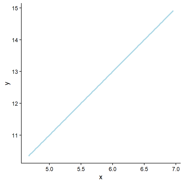
A straight line can be used to describe a relationship between two variables. As seen in Figure 6.1, the relationship between the variables x and y is perfectly positive. When moving one unit on the x-axis, we observe a corresponding change in potentially observed values on the y-axis. This relationship can also be described by finding the unknown (parameter) values in the formula:
\[y = \beta_0 + \beta_1x\]
Where \(y\) is the outcome variable, \(\beta_0\) is the intercept, \(\beta_1\) is the slope, and \(x\) is the predictor. The word “linear” does not mean that we are restricted to only model straight lines. Instead, linear means that parameters (\(\beta_0\), \(\beta_1\), etc.) are combined linearly, by summation to describe \(y\).
In the model shown above, \(y\) increases by two units for every unit increase in \(x\). Suppose we measure something in nature and find such a fit (every point on the line). In that case, we should verify our calculations, as perfect relationships are seldom found in measured variables. This is due to measurement error and other unmeasured variables that affect the relationship we are measuring. To capture additional variation we can add some details to the notation presented above. For a specific observation (\(y_i\)), we quantify unmeasured sources of variation in an additional term in the formula.
\[y_i = \beta_0 + \beta_1x_i + \epsilon_i\]
Where \(\epsilon\) is called the error term. Here we quantify the distance from the best-fit line, or the estimated value for each observation (\(\hat{y}_i\)) to the observed value (\(y_i\)). The best fit line is the line that minimizes the sum of the squared residual error, or the differences between estimated and observed values:
\[\sum\limits_{i=1}^{n}\epsilon_i^2 = \sum\limits_{i=1}^{n}(y_i - \hat{y}_i)^2\] When the above expression is minimized we have the best fitting model. As noted above, real data do not follow the straight line, instead it contains some additional variation making each observation deviate from the general trend, as shown in Figure 6.2.
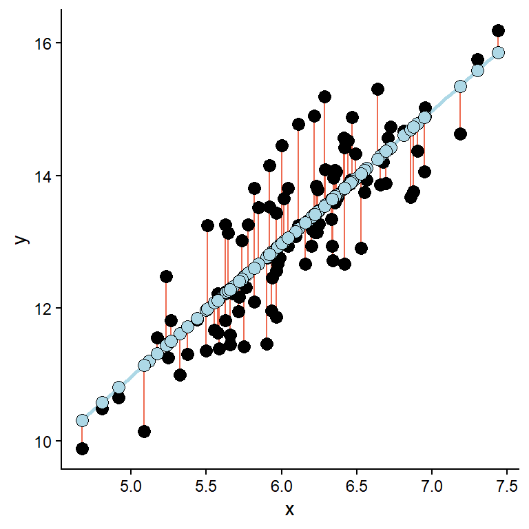
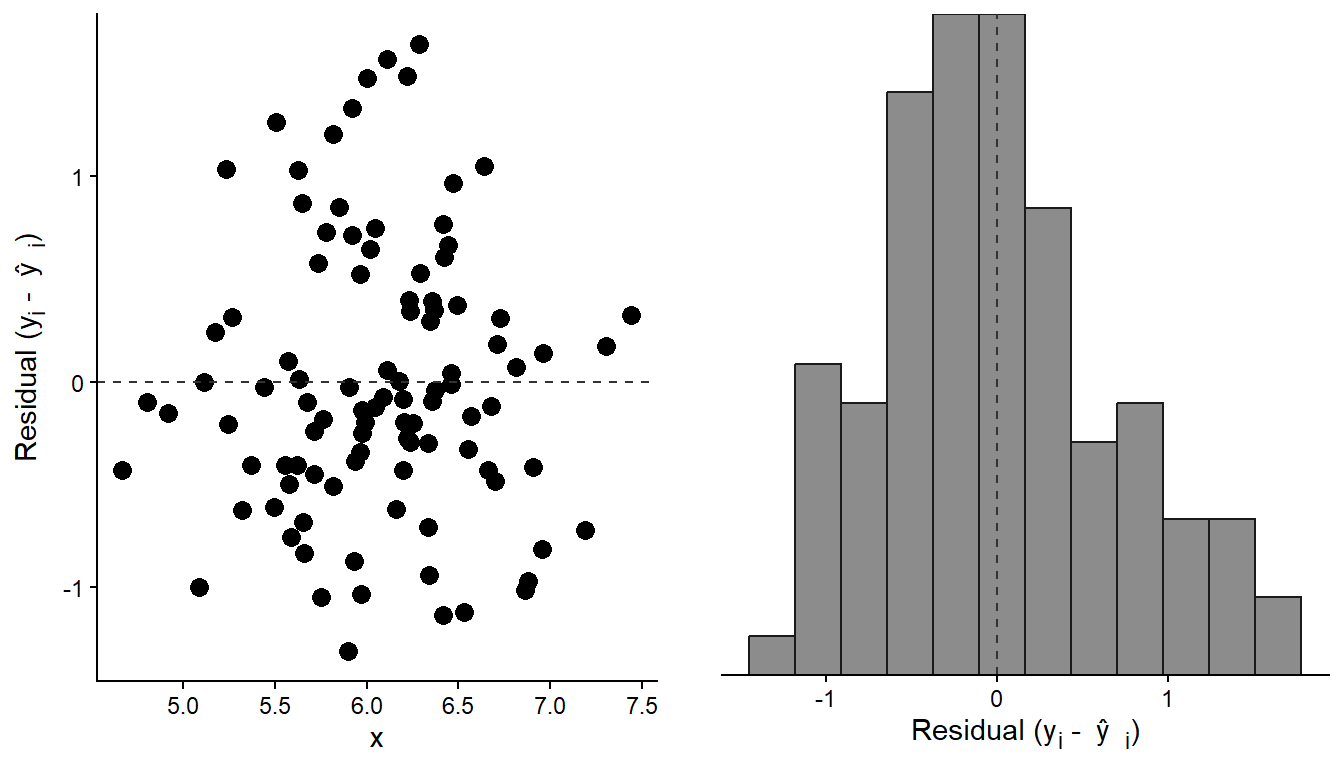
In the above figure, the errors, or residuals, are highlighted as the distance (red lines) between the predicted (blue points) and the observed (black points) values. Suppose we extract the residuals from the above model and plot them. In the resulting plot, we observe that they are evenly distributed across the observed x-values. We can be even more formal in our description of the resulting distribution. Overall, the residuals form a distribution that can be approximated with a theoretical distribution called a Normal distribution (Figure 6.3).
The regression model outlined so far can be redefined using an alternative notation. We could describe the y-values as being normally distributed, having a mean (\(\mu\)) that is related to the x-values and a standard deviation (\(\sigma\)).
\[ \begin{align} y &\sim \operatorname{Normal}(\mu,~\sigma) \\ \mu &= \beta_0 + \beta_1 x \end{align} \] This notation offers two key advantages: it explicitly adds an assumption to the description of our model, namely that we view the outcome variable (\(y\)) as normally distributed given each specific value of \(x\) with a constant variation (\(\sigma\)) around the mean (\(\mu\)). Second, compared to adding a specific error term (\(y = \beta_0 + \beta_1x + e\)), the model formulation can be extended to other distributions (such as binomial for logistic regression or Poisson for count data), forming the foundation of generalized linear models. This is all very technical, and the benefits are not immediately apparent in simple examples, but preparing for more complex models will save us from later headaches.
1 Chapter 5 in (Spiegelhalter 2019) serves as a good introduction to regression. In addition, there are several basic texts on regression that also includes references to R, for example, Navarros Learning statistics with R, Chapter 15. The JASP student guide may be a bit technical but directly describes the regression module in JASP.
Spiegelhalter, D. J. 2019. The Art of Statistics : How to Learn from Data. Book. First US edition. New York: Basic Books.
6.2 Using software to fit regression models
The goal of fitting a regression model to data is to determine the most appropriate values for the parameters used to build the model. A parameter contributes to defining a statistical (theoretical) model, which can, for example, describe data (see Altman and Bland (1999) for a clear definition). Above, we defined a simple regression model using three parameters: the intercept (\(\beta_0\)), the slope (\(\beta_1\)), and the standard deviation (\(\sigma\)), which together determine the mean and the variation around it. Our computer will find the most suitable values for these parameters. In many cases, they can be interpreted directly in the context of the data (examples to come).
Altman, D. G., and J. M. Bland. 1999. “Statistics Notes: Variables and Parameters.” BMJ (Clinical Research Ed.) 318 (7199): 1667. https://doi.org/10.1136/bmj.318.7199.1667.
Fitting a simple regression model in JASP or R is straightforward. We define the variables that go into the model as dependent and independent variables, and let the computer handle the rest. Using R, we define the model using a model formula. From the simple example above, we have two variables (\(x\) and \(y\)). Using the model formula syntax, we would say that we want to explain \(y\) by \(x\) as y ~ x. This model syntax is used in the workhorse function lm() (linear model) to give a full syntax looking like this.
m <- lm(y ~ x, data = d) The above assumes that data are stored in a data frame, d. We save the model in an object m which can be explored further (examples to come).
In JASP, under Regression → Classical → Linear Regression, we will find the module for fitting regression models. Here, we choose the variable that will be the dependent variable and any variables used for independent variables. These can be numerical variables (interpreted as continuous variables) or categorical variables (Factors).
Let’s fit some real data. We are using the cyclingstudy dataset (see Table 1; also available in the exscidata package), and we might wonder if there is some characteristic that is related to VO2max. For example, do taller individuals have greater VO2max? It is always a good idea to start with a plot before we do the modelling (Figure 6.4).
Code
library(tidyverse)
library(exscidata)

# Prepare the data
exscidata::cyclingstudy |>
  # Filter to only keep pre-intervention data
        filter(timepoint == "pre") |>
  # Select only relevant variables
        select(subject, group, VO2.max, height.T1) |>
  # Set up the ggplot
         ggplot(aes(height.T1, VO2.max)) +
       geom_point(size = 3,
             fill = "lightblue",
             shape = 21) +
         labs(x = "Height (cm)",
              y = expression("VO"["2max"]~(ml^-1~min^-1))) +
         theme_classic()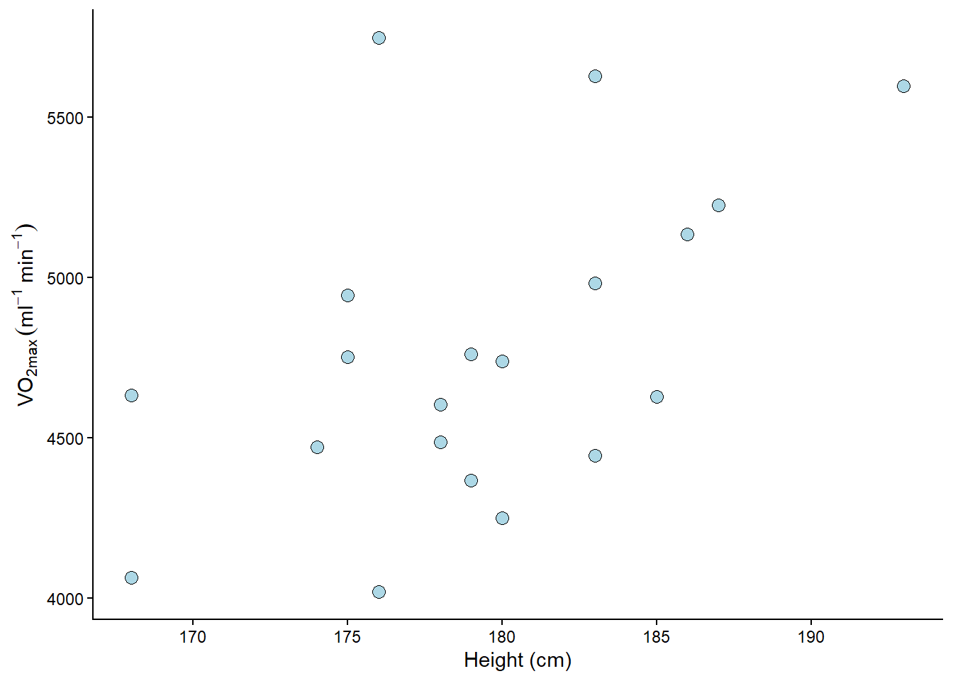
There might be a positive relationship between the variables. What do you think? You might get a clearer picture if you use R and ggplot2. You can add geom_smooth(method = "lm") in your ggplot command to get an estimated model. Try it out (or see below)!
To quantify the relationship between height (height.T1) and VO2max (VO2.max), we can fit a linear model. Before examining the results of the regression model, we should consider the data and inspect the fit to determine if it aligns with our assumptions about the data and the model. Assumptions that generally need to be met to get a valid regression model are:
Independent observations. This is an assumption regarding the study design and the available data. If we have observations that are related, the ordinary linear model will give us biased conclusions. For example, suppose we collect data from the same participants over time. In that case, we will not have independent observations, which will lead to something called pseudo-replication, misleading us into being more certain about our results than we should be. Another way to view it is that non-independent observations will result in non-independence of the residuals, which is the mechanism that creates poor inference and a flawed representation of the system being studied.
Linear relationship. In the basic case, we expect a trend that can be described with a straight line. If the relationship is curve-linear, we may adjust the fit using, e.g., polynomials (more on this later). The relationship between Height and VO2max is plotted in Figure 6.5 A and highlighted with a best fit line.
Normal residuals. This condition might be violated when there extreme observations in our data, extreme relative to the majority of our observations. Residuals from a model of the relationship Height and VO2max are plotted in Figure 6.5 B and C.
Constant variance. This assumption states that we want to be equally wrong across the entire range of the explanatory variable. If we predict \(y\) with greater error at large \(x\), we have heteroscedasticity (unequal variance); if we are “equally wrong”, we have homoscedasticity (equal variance). Residuals from a model of the relationship Height and VO2max are plotted in Figure 6.5 D against the predictor variable (Height).
Fitting the model and plotting the data
library(tidyverse)
library(exscidata)
library(ggtext)
library(cowplot)


cyc_select <-  cyclingstudy %>%
        filter(timepoint == "pre") %>%
        select(subject, group, VO2.max, height.T1)

m1 <- lm(VO2.max ~ height.T1, data = cyc_select)


## Plotting the raw data together with a best-fit line

figa <- cyclingstudy %>%
        filter(timepoint == "pre") %>%
        select(subject, group, VO2.max, height.T1) %>%
  ggplot(aes(height.T1, VO2.max)) +

    geom_smooth(method = "lm", se = FALSE, color = "black") +

    geom_point(size = 3,
             fill = "lightblue",
             shape = 21) +


         labs(x = "Height (cm)",
              y = "VO<sub>2max</sub> (ml<sup>-1</sup>min<sup>-1</sup>)") +
         theme_classic() +
  theme(axis.title.y = element_markdown())

## Extracting and plotting residuals

figb <- cyclingstudy %>%
        filter(timepoint == "pre") %>%
        select(subject, group, VO2.max, height.T1) %>%
  mutate(yhat = fitted(m1)) %>%

  ggplot(aes(height.T1, VO2.max, group = subject)) +

  geom_segment(aes(y = yhat, yend = VO2.max, x = height.T1, xend = height.T1),
               color = "red") +

  geom_point(size = 3,
             fill = "lightblue",
             shape = 21) +

  geom_point(aes(height.T1, yhat),
             size = 3, fill = "orange", shape = 21) +

  geom_smooth(method = "lm", se = FALSE) +

         labs(x = "Height (cm)",
              y = expression("VO"["2max"]~(ml^-1~min^-1))) +
         theme_classic()


 figc <- cyclingstudy %>%
        filter(timepoint == "pre") %>%
        select(subject, group, VO2.max, height.T1) %>%
  mutate(yhat = fitted(m1),
         resid = resid(m1)) %>%

   ggplot(aes(resid)) +

   geom_density(aes(resid),

                color = "orange") +
     geom_rug(color = "orange") +

   scale_x_continuous(limits = c(-1200, 1200)) +

   stat_function(fun = dnorm, n = 101, args = list(mean = 0, sd = 425),
                 color = "steelblue") +

   labs(x = "Residuals",
        subtitle = "The <span style = 'color: orange;'>observed residual distribution</span> <br> and a <span style = 'color: #4682b4;'>Normal distribution</span> with mean 0 and SD of 425") +

   theme_classic() +
   theme(axis.text.y = element_blank(),
         axis.ticks.y = element_blank(),
         axis.title.y = element_blank(),
         axis.line.y = element_blank(),
         plot.subtitle = element_markdown())


figd <- cyclingstudy %>%
        filter(timepoint == "pre") %>%
        select(subject, group, VO2.max, height.T1) %>%
  mutate(yhat = fitted(m1),
         resid = resid(m1)) %>%
  ggplot(aes(height.T1, resid)) + geom_point() +
  theme_classic() +
  geom_hline(yintercept = 0, lty = 2, color = "gray50") +
  labs(y = "Residuals", x = "Height (cm)")


plot_grid(figa, figb, figc, figd, ncol = 2) +
cowplot::draw_label(label = "A", x = 0.02, y = 0.98) +
cowplot::draw_label(label = "B", x = 0.52, y = 0.98) +
cowplot::draw_label(label = "C", x = 0.02, y = 0.51) +
cowplot::draw_label(label = "D", x = 0.52, y = 0.51) 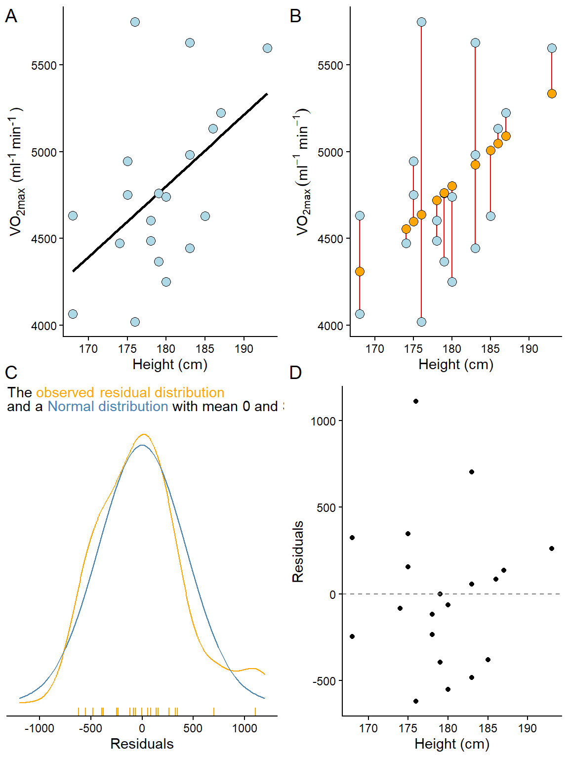
6.2.1 Checking our assumptions
Linear relationship
A plot (e.g. Figure 6.5 A) can be used to see if the relationship is generally linear. We do not have a large number of data points, but a linear relationship is not evident. To reproduce a similar figure in JASP we can use a “Partial plots” under Plots in the Regression module used to fit the model.
Normal residuals
To check if the residuals are normal (like Figure 6.5 C suggests), we can create a plot that plots every observed residual against its theoretical position in a normal distribution. This is a quantile-quantile plot. To illustrate the concept, we can sample data from a normal distribution and plot it against the theoretical quantile (Figure 6.6).
Show the code
set.seed(1)
ggplot(data.frame(y = rnorm(100, 0, 1)), aes(sample = y)) +
  stat_qq(size = 3, fill = "lightblue", shape = 21) +
  stat_qq_line() +
  labs(x = "Theoretical Quantiles",
       y = "Sample Quantiles") +
  theme_classic()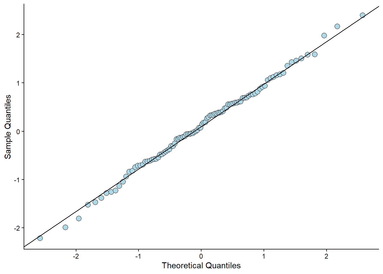
The code above samples 100 observations. They are plotted against their “theoretical values”. If the values (points) follow a straight line, we have data that follows a normal distribution. This can also be assessed from our fitted model (Figure 6.7).
Show the code
cyclingstudy %>%
        filter(timepoint == "pre") %>%
        select(subject, group, VO2.max, height.T1)  %>%
        mutate(resid = resid(m1),
               st.resid = resid/sd(resid)) %>%
        ggplot(aes(sample = st.resid)) +
         stat_qq(size = 3, fill = "lightblue", shape = 21) +
                 stat_qq_line() +
                 theme_classic()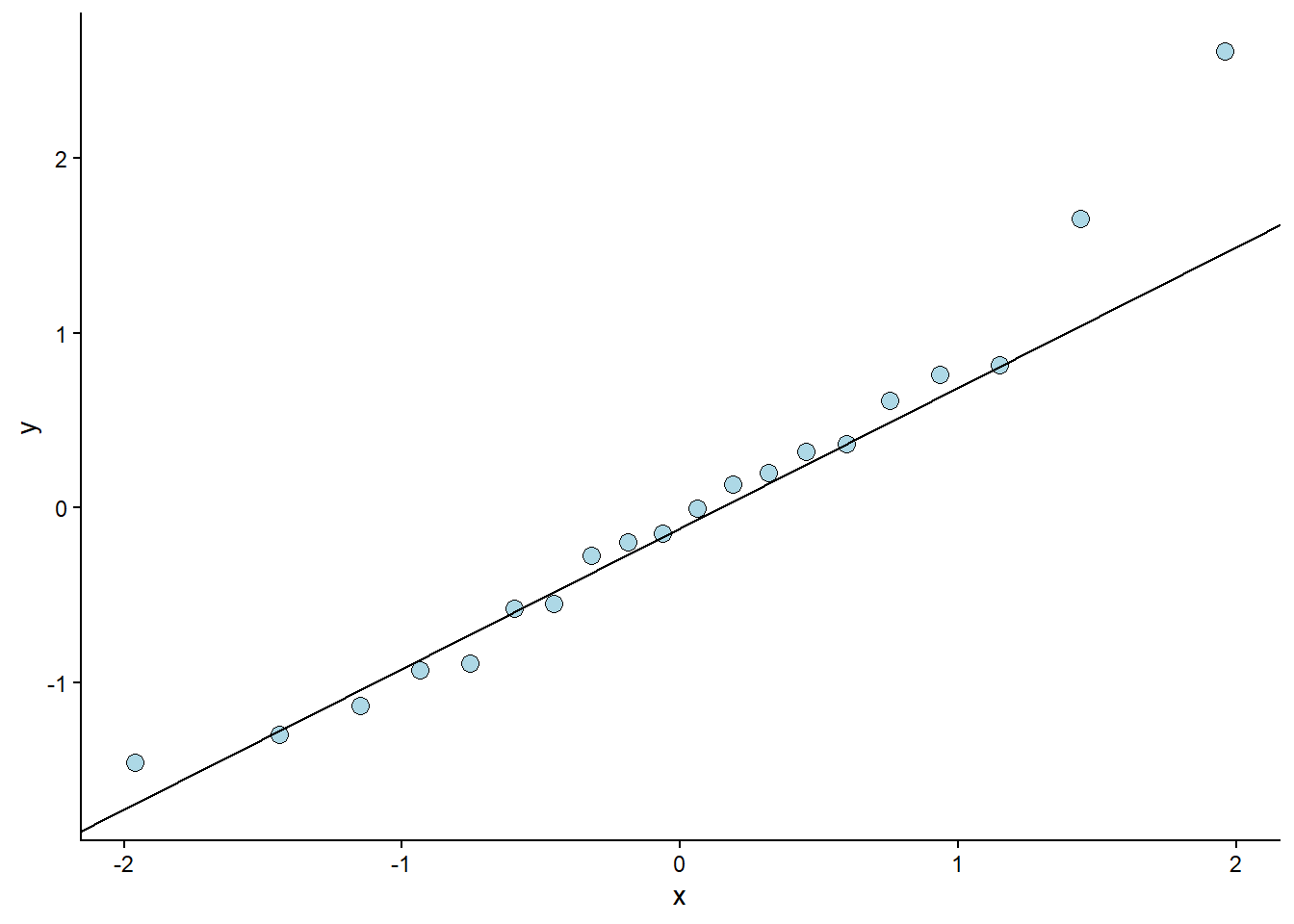
The resulting plot looks ok. Except for one or two observations, the residuals follow what could be expected from a normal distribution2. This corresponds to our overlay in Figure 6.5 C. The qq-plot is, however, a more formal way of assessing the assumption of normally distributed errors. To reproduce this figure in JASP, we can use the “Q-Q plot standardized residuals”.
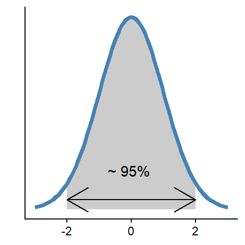
2 What is normal? A normal distribution is described with a mean and a standard deviation. The distribution is bell-shaped, and approximately 95% of the distribution can be found within two standard deviations above and below the center (mean) of the distribution.
Constant variance
This assumption can be checked by creating a residual plot (e.g., Figure 6.5 D). We will do a variation of this plot below by hand to see how it works. The model is fitted and stored in the object m1. From this object, we can use the residuals() function to get every residual. We can add this data to the data set by creating a new variable called resid. It is common practice to plot the residuals against the fitted values. We can get the fitted values using the fitted(); these are the predicted values from the model.
We will plot the fitted values against the residuals. If the model is equally wrong throughout the fitted values (or the predictor values, as in Figure 6.5 D), we have homoscedasticity. The residual plot should not show any obvious patterns.
Show the code
data.frame(resid = resid(m1),
           fitted = fitted(m1)) %>%
        ggplot(aes(fitted, resid)) +

    labs(x = "Fitted values",
       y = "Raw Residuals") +


        geom_hline(yintercept = 0) +
        geom_point(size = 3, fill = "steelblue", shape = 21) +
        theme_classic()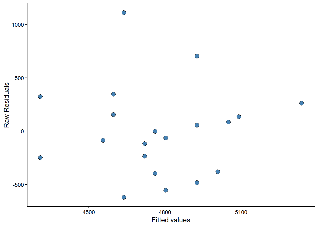
Sometimes you will see standardized residuals. This is the residual divided by the standard deviation of the residual. We can create this standardization like this:
Show the code
data.frame(resid = resid(m1),
           fitted = fitted(m1)) %>%
        mutate(st.resid = resid/sd(resid)) %>%
        ggplot(aes(fitted, st.resid)) +

  labs(x = "Fitted values",
       y = "Standardized Residuals") +

        geom_hline(yintercept = 0) +
        geom_point(size = 3, fill = "lightblue", shape = 21) +
        theme_classic()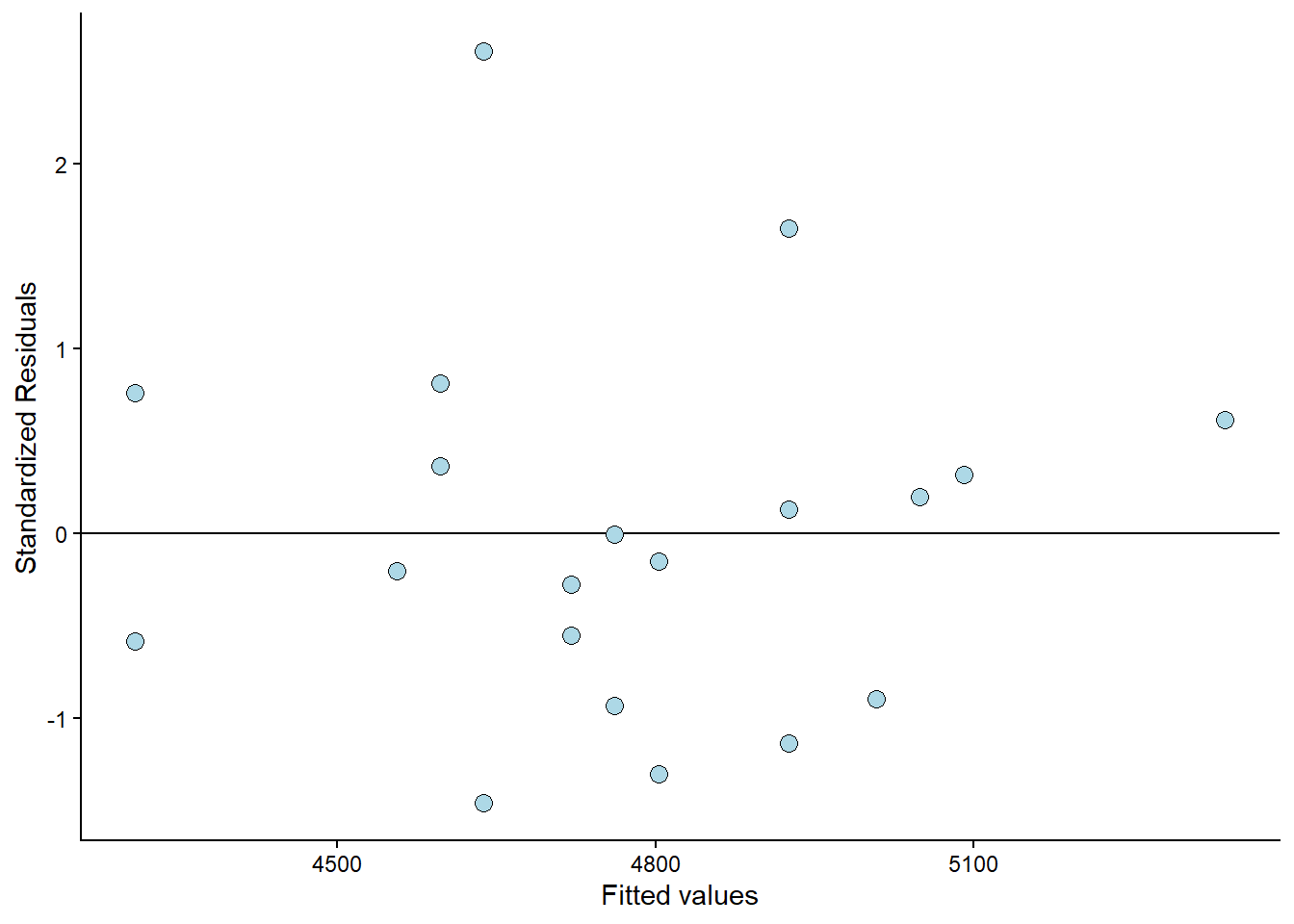
Examining the plot (Figure 6.10) reveals that the observation with the most significant error is approximately 2.5 standard deviations away from its predicted value. We are somewhat limited by the small amount of data available here. But the residual plot does not invalidate the regression model.
In JASP, variations of the above plot can be produced using selections under “Residuals Plots” under Plots in the regression module.
6.3 Check the results
To examine the results of the analysis in R, we can use the summary() function.
summary(m1)
Call:
lm(formula = VO2.max ~ height.T1, data = cyc_select)

Residuals:
    Min      1Q  Median      3Q     Max
-619.99 -279.54  -32.56  181.82 1109.81

Coefficients:
            Estimate Std. Error t value Pr(>|t|)
(Intercept) -2596.26    2936.51  -0.884   0.3883
height.T1      41.10      16.37   2.511   0.0218 *
---
Signif. codes:  0 '***' 0.001 '**' 0.01 '*' 0.05 '.' 0.1 ' ' 1

Residual standard error: 436.8 on 18 degrees of freedom
Multiple R-squared:  0.2594,    Adjusted R-squared:  0.2183
F-statistic: 6.306 on 1 and 18 DF,  p-value: 0.02179
The output in R (see above) will show you the following things:
Call:this summary contains your instructions to R.Residuals:which contains the minimum, maximum, median and quartiles of the residuals. The tails should be approximately similar above and below the median.Coefficients:contains the parameter estimates and their standard errors. As we have fitted a univariate model, we only see the increase in VO2max with every unit increase ofheight.T1and the intercept.Residual standard error:Tells us the variation in the error on the scale of the outcome variable. As mentioned above this is very similar to calculating the standard deviation of the residual. The difference is that it takes into account that we have estimated other parameters in the model.R-squaredand additional statistics: shows the general fit of the model, the R-squared value is a value between 0 and 1 where 1 indicates that the model fits the data perfectly (imagine all observations correspionding to what the model predicts).
The same information is available in JASP. In the Results tab, a first table shows model summaries, including the R2 value. The second table shows the parameter values and related statistics (standard errors, t-values and p-values). Notice that JASP shows a null-model (M0) for comparison used when model comparisons are used for inference.
6.4 Interpreting the results
From our model we can predict that a participant with a height of 175 cm will have a VO2max of 4597 ml min-1. We can do this prediction by combining the intercept and the slope multiplied with 175. We remember the equation for our model:
\[\begin{align} y_i &= \beta_0 + \beta_1x_i \\ \text{VO}_{2\text{max}} &= -2596.3 + 41.1 \times 175 \\ \text{VO}_{2\text{max}} &= 4597 \end{align}\]
In R, we can use coef() to get the parameter values (also called regression coefficients) from the model. To make the above prediction, we can use the following R code coef(m1)[1] + coef(m1)[2]*175. Using confint(), we will get confidence intervals for all parameters in a linear model.
We will discuss confidence intervals, t-values, and p-values in later chapters. For now, a brief introduction may suffice. The confidence interval can be used for hypothesis testing, and so can p-values from the summary table. The p-value tests against the null-hypothesis that the intercept or slope is 0. What does that mean in the case of the intercept in our model? The estimated intercept is -2596, meaning that when height is 0, the VO2max is -2596. We are very uncertain about this estimate as the confidence interval goes from -8766 to 3573. We cannot reject the null. Think for a minute about what information this test gives us.
The slope estimate has a confidence interval that goes from 6.7 to 75.5, which means that we may reject the null-hypothesis at the 5% level. The hypothesis test of the slope similarly tests against the null hypothesis that VO2max does not increase with height. Since our best guess (the confidence interval) does not contain zero, we can reject the null hypothesis.
6.5 Do problematic observations matter?
In the residual plot, we could identify at least one problematic observation. We can label observations in the residual plot to find out which observation is problematic.
Show the code
cyclingstudy %>%
        filter(timepoint == "pre") %>%
        select(subject, group, VO2.max, height.T1)  %>%
        mutate(st.resid = resid(m1)/sd(resid(m1)),
               fitted = fitted(m1)) %>%
        ggplot(aes(fitted, st.resid, label = subject)) +
        geom_hline(yintercept = 0) +
        geom_point(size = 3, fill = "lightblue", shape = 21) +
        geom_label(nudge_x = 25, nudge_y = 0) +

    labs(x = "Fitted values",
       y = "Standardized Residuals") +

theme_classic() 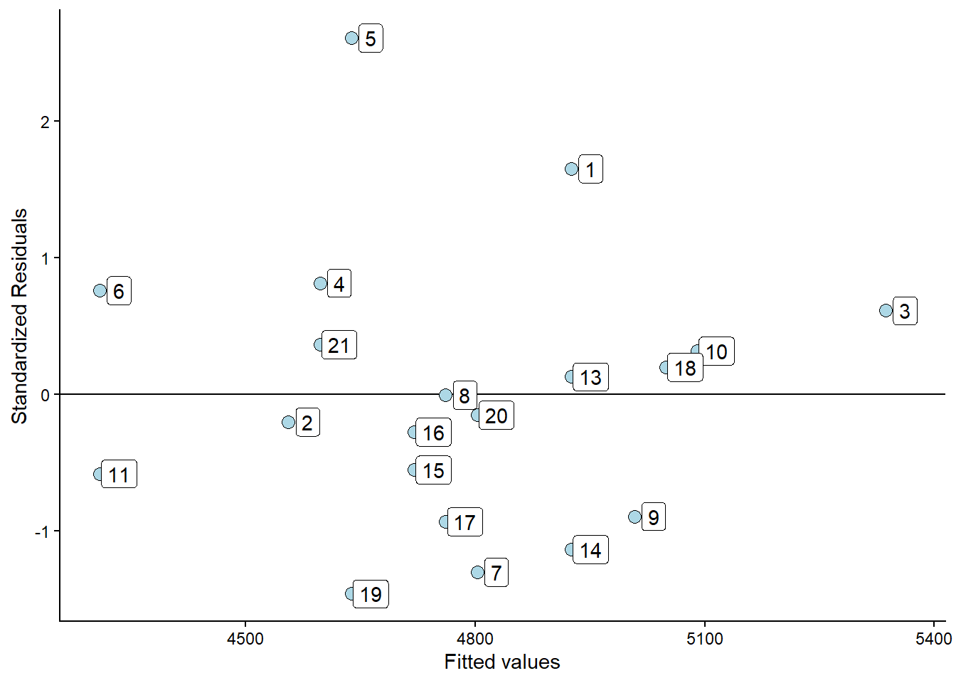
The plot shows that participant 5 has the greatest distance between observed and predicted values. Suppose we fit the model without the potentially problematic observation. In that case, we can see if this changes the conclusions from our analysis.
cyclingstudy_reduced <- cyclingstudy %>%
        filter(timepoint == "pre",
               subject != 5) %>%
        select(subject, group, VO2.max, height.T1)

m1_reduced <- lm(VO2.max ~ height.T1, data = cyclingstudy_reduced)


delta_beta <- 100 * ((coef(m1_reduced)[2]/coef(m1)[2]) - 1)
In the R code above, the delta_beta calculates the percentage change in the slope resulting from removing the observation with the greatest residual. The slope changes 13% when we remove the potentially problematic observation. This might be of importance in your analysis. Another way to identify influential data points is to examine the scatter plot.
Show the code
cyclingstudy %>%
        filter(timepoint == "pre") %>%
        select(subject, group, VO2.max, height.T1) %>%
         ggplot(aes(height.T1, VO2.max, label = subject)) +
  geom_smooth(method = "lm", se = FALSE) +
  geom_point(size = 3, fill = "lightblue", shape = 21) +
         labs(x = "Height (cm)",
              y = expression("VO"["2max"]~(ml^-1~min^-1))) +
                geom_label(nudge_x = 1, nudge_y = 0) +
         theme_classic()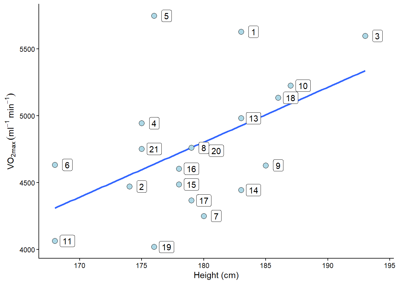
The plot will show participant 5 has not got a lot of “weight” in the slope. If an equally large residual had been present at the far end of the height variable’s range, removing it would have made a greater difference. Since the observation is in the middle of the predictor variable, it won’t be that influential.
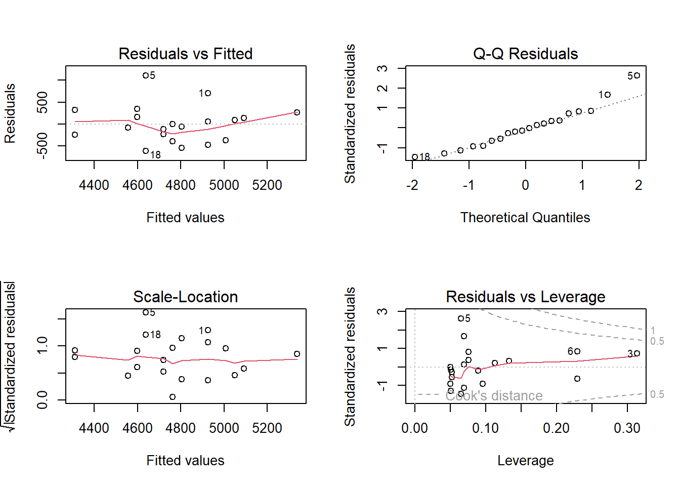
There are several methods for performing diagnostics on the ordinary linear model in R. Above, we manually coded plots to diagnose regression models. However, the simplest way to get a broad set of diagnostic plots is to write plot(m1), which will produce four graphs.
Residuals vs. Fitted shows the fitted (or predicted) values against the residuals. If we had tried to fit a linear trend to curved data, we would have caught it here. We want an equal spread all along the fitted values. We test the assumption of homoscedasticity and linear trend.
Normal Q-Q shows residual theoretical quantiles against the observed quantile. The points should, to a large degree, be on or close to the line. We test the assumption of normality in the residuals.
Scale location similarly to the residual plot, we can assess assumptions of heteroscedasticity, and if we find a trend in the data. We are looking for a straight, flat line and points equally scattered around it.
Residual vs. Leverage is good to find influential data points. If a point lies outside the dashed line, it significantly alters the conclusion of the regression analysis. Remember that we identified participant 5 as a potential problematic case. The Residual vs. leverage shows that number 5 has a large residual value but no leverage, meaning that it does not change the slope of the regression line.
6.6 A more interpretable model
The intercept in model m1 is interpreted as the VO2max when height is zero. We do not have any participants with a height of zero, nor will we ever have. A nice modification to the model would be to have the intercept reveal something useful. We could use the model to determine the VO2max for the tallest or shortest participant by setting their values to zero. Even more interesting would be to get the VO2max at the average height.
We accomplish this by means-centering the height variable. We remove the mean from all observations; this will place the intercept at the mean height, as the mean will be zero.
cyc_select <- cyclingstudy %>%
        filter(timepoint == "pre") %>%
        select(subject, group, VO2.max, height.T1)  %>%
        mutate(height.mc = height.T1 - mean(height.T1)) # mean centering the height variable

m2 <- lm(VO2.max ~ height.mc, data = cyc_select)
Examine the fit. What happens to the coefficients? The slope remains the same, indicating that our model predicts the same increase in VO2max for every unit increase in height. The intercept has changed; instead of giving us the estimated VO2max when the measured height is 0, we get the estimated VO2max when the measured height is at its mean. That might be a more interpretable quantity.
6.6.1 A note about printing the regression tables in R
We might want to print the regression table (coefficients) in our reports. To do this nicely, we might want to format the output a bit. This can be done using a package called broom. broom is not part of the tidyverse, so you might need to install it. The package has a function called tidy that takes model objects and formats them into tidy data frames, making them easier to work with. Together with the gt package, we can create tables for use in the report. The gt function creates nice tables with specific arguments to format the table.
library(gt); library(broom)

tidy(m1) %>%
  gt() %>%
fmt_auto()| term | estimate | std.error | statistic | p.value |
|---|---|---|---|---|
| (Intercept) | −2,596.261 | 2,936.508 | −0.884 | 0.388 |
| height.T1 | 41.105 | 16.369 | 2.511 | 0.022 |