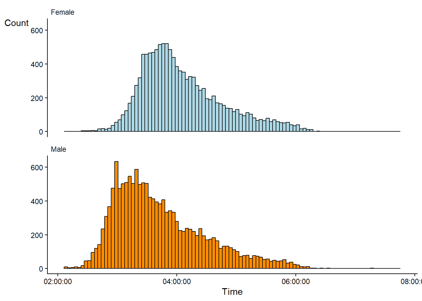
3 Data distributions
When we observe data, we can describe it by its central tendency and dispersion. However, it is also often useful to describe the distribution of the data graphically to get a sense of the shape of the data. A histogram can help us with this representation. A histogram divides a numeric variable into bins and counts the number of observations in each bin. The number of observations in each bin is then displayed as a bar plot, with each bar representing a bin (Figure 3.1)1. In Figure 3.1, a separate histogram has been created for each gender in the data set.
1 In JASP, the Descriptive Statistics module lets us create a basic histogram; however, here it is called Distribution plots with the possibility to add density estimates.
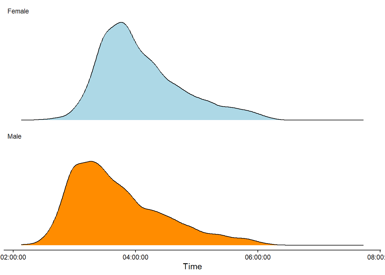
An alternative to the histogram is a density plot. The density plot shows us the relative density of observations along the scale of the variable of interest. Often, the curve shows a smoothed estimate of the distribution (Figure 3.2). In a density plot, the y-axis may be omitted as the values are arbitrary.
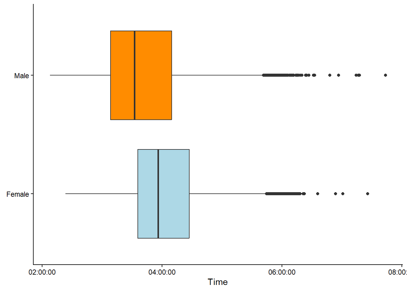
An alternative approach to summarize a disribution could be a boxplot (Figure 3.3). A boxplot summarises the data by displaying the median, the first and third quartile (the box). The whiskers covers observations within 1.5 × the inter-quartile range from the box. Observations above the whiskers are displayed using points.
Categories can also be summarised as using frequencis. In the figure below we have categorized age in bins creating and ordered categorical variable (ordinal), a second categorical variable, gender (nominal), let’s us compare the number of observations between Males and Females within each age group.
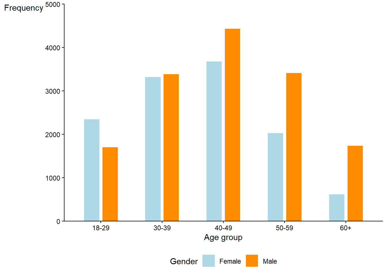
The shape of the data is of interest to us (Sokal and Rohlf 2012, 19). For example, in the above figures we can notice that only a very small proportion of the competitors approaches the 2 hour mark.2 The distribution is skewed to the right and we might discover some unusual peaks in the histogram at three and four hours. Additionally, we see a slight over-representation of women in the age category 18-29. Patterns like these in the data could lead us to further investigate, for example, the limits of human performance (why no sub 2 hour times?), the psychology of specific run times (why do many men finish at sub 3 hours?) or the general demographics of the participants (the tail of the distribution and gender differences in participation).
Sokal, Robert R., and F. James Rohlf. 2012. Biometry : The Principles and Practice of Statistics in Biological Research. [Extensively rev.] 4th. New York: W.H. Freeman.
2 The marathon world records are 2:00:35 and 2:09:56, for men and women, respectively (source).
3.1 Theoretical data distributions
Above we have